


Changing out your neutral shades for a bolder look at home can sometimes be a daunting prospect. But taking the leap and starting to style with bold color can not only transform your space, but also set a whole new mood, especially as you can begin to swap out those brighter elements season after season. Being daring with color at home lets you tell your personal style story, and add vibrant cheer room by room.
To help you make the change-up in your home, we’ve picked out the best colors to style boldly in every room. As a source of inspiration, we’ve also shone a spotlight on some of the best neon attractions on the planet to help guide you. Looking for more? Why not elevate your space with five iconic Pantone colors?
Styling Bold Color In Every Room
Neon Attractions Around The World to Inspire your Home
How To Style Your Home Using Five Iconic Pantone Colors
Styling Bold Color in Every Room
When it comes to interior design, there are three basic color themes to embody.
Tonal: This is where you choose one base color and use variations of it across the room. This works well for contemporary rooms. For example, in a muted, monochrome space, use different shades of grey or blue on the furnishings, accessories, and walls. Layering multiple shades of white can also be used to create an ultra-modern or traditional room, depending on the textures the colors are applied to.
When you get the tonal approach right, this allows you to go wild on layering up bold shades on top, through vivid color, bright prints, and even neons (which we’ll get to later!).
Harmonious: Using colors that are close on the color wheel, and complement each other without being too similar.
It's easy to create a specific theme with a harmonious room – green, white and brown can create a country-cottage vibe while light blue, white and grey can be used for a fresh, modern feel.
Complementary: A bolder approach, complementary color schemes use opposites to create a statement in the room. Colors still correspond, but the contrast is much stronger than in a harmonious scheme.
Another way to narrow it down when it comes to choosing a room color, is to think about how you want to feel when you enter that room. Color is strongly associated with mood and has been proven to bring several impacts on the ambience of the room.
How does color set the mood?
Energized: Vibrant colors and shades of white are stimulating and can be perfect for a busy environment.
Romantic: Accompany silver and grey with deep jewel tones for a lavish and decadent feel.
Whimsical: Mixing several shades together, and adding texture and clashing patterns can result in a fun room that reflects your unique personality.
Calm: Using a stripped-back color scheme with a key feature shade is a great way to design a contemporary room that is idyllic, with a splash of confident color.
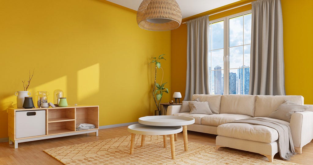
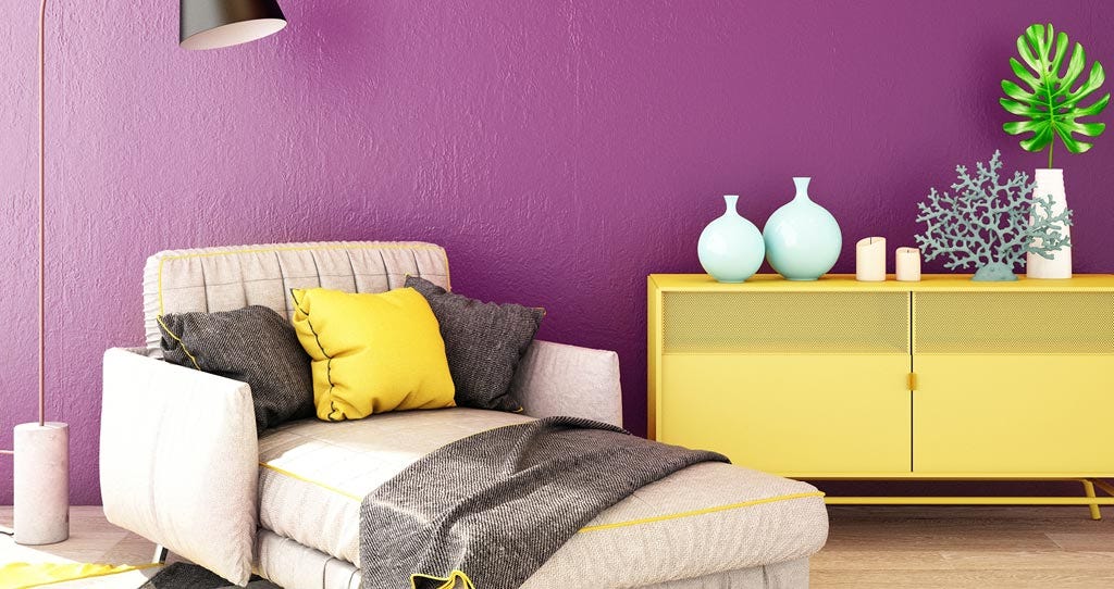
Living Room
We spend a large part of our time in our living rooms so the color of it is important. It’s the focal point of our homes. Nobody wants to spend hours every day in a dark or gloomy space. This is why color combinations are so important and an essential part when it comes to decorating a living room.
Royal Blue - The deep blue paint alone is a bold color choice, and will make you feel like you're on holiday, even if the closest you're getting to an island escape is searching through Instagram. Complement this look with a deep blue Chesterfield sofa and gold accents.
Turquoise - Take your pick from the various shades of turquoise, from the sea green tone to mint. It’s a perfect color for dispersing light through a room, making it the ideal partner to a white base.
Yellow - One of Pantone’s 2021 colors of the year was Illuminating Yellow. Pairing this bold color with chocolate browns and blacks will give your room a classic leopard print feel. While color blocking between yellows and whites gives you a modernist effect.
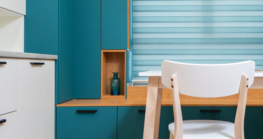
Kitchen
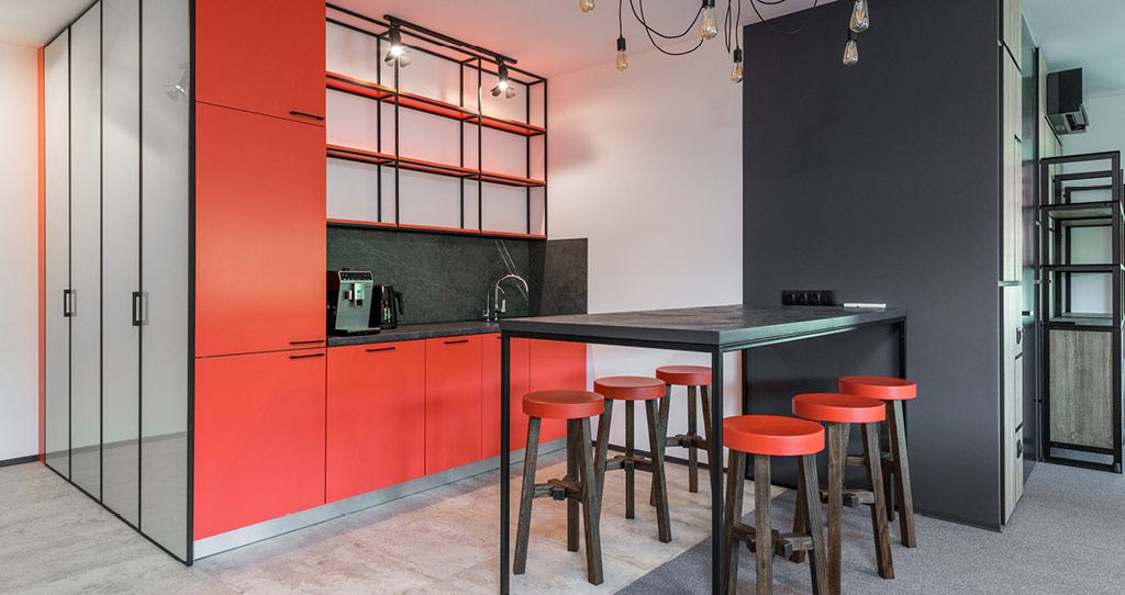
Years of conventional kitchen color planning have proven that warm, and bright colors are most effective in creating not only a pleasant environment to cook in, but also a welcoming one to visit.
Although it may feel natural to use white shades to make a space feel bigger (especially in a smaller kitchen) and cleaner, remember that incorporating your personality through bright colors is just as important.
The colors serve several functions; they tie the room together, keep the space feeling clean enough to prep food in, and help create a sense of openness, if you get the mix right.
Teal - Teal kitchens are gaining popularity among homeowners and interior designers alike. To really accentuate the calming effect of teal, add some succulent plants to your kitchen - indoor plants have been shown to improve mood, plus the beautiful greenery teams well with teal, creating a tonal look.
Red - While red kitchens can make us think of rustic settings, ultra reds can bring a kitchen space to life and give it a clean, modern look that’s filled with personality. If you’re working with a neutral base, painting cabinets (including kitchen islands) in a bold red will bring the space to life with contrasting materials and colors.
Black and white - Surprise yourself with a monochromatic look. This classic color palette will always pay off for your home with a beautiful kitchen that won’t go out of style.
Lemon Yellow - A perfectly versatile color for your kitchen. Go for a full sunshine look with an all-yellow room, or make your appliances stand out from the rest of your space by opting to buy them in similar shades.
Bathroom
Cleanliness and openness is key for making bathroom colors work. Similarly to the kitchen, you can’t have a space that feels small and overbearing because of the color. Try and think of the flow of the rest of your home when you’re choosing a bathroom color, complementary is best, even if you’re not totally matching your entire space.
How to choose the right colors
Lighting - No matter what color you choose, poor lighting can turn the best paint color into something less desired so it’s best to do a test swatch with your preferred paint color to make sure it looks good in the space.
Flooring and Existing Fixtures - The color and style of your flooring and existing fixtures play a significant role in your paint color choice. The key is to pick a complementary color and a focal point.
Room Size - The right color on your walls can make a small bath feel bigger and a large bath feel cozy. If your bathroom is small, consider a bright or bold color to help visually expand a space. Use a darker shade to make your large bathroom feel cozier. The right color influences how a room looks and feels.
Three Bathroom Paint Color Ideas
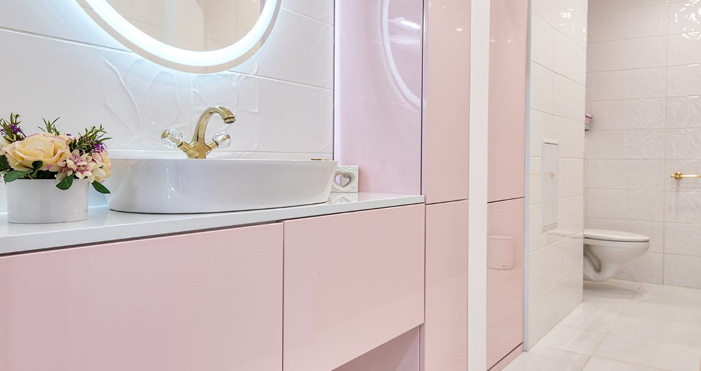
Pink - Pink bathrooms were a 70s staple, but are making a huge revival in this current interior era. The variety of tones in pink can give your space a luxury feel, especially when paired with golden accessories and plant prints.
Green - Green can be incredibly versatile no matter your taste or style. You could go for an art deco revival with emerald green everything, ushering in the 1920s in full swing. Or if patterns are more your thing, zig-zag or candy stripe green and whites are ideal for bringing your space to life.
Charcoal - Feeling moody? Whip out the charcoal paint and create a brooding and mysterious bathroom aesthetic. Add some structural light fixtures and an oversized tub, and you’re set.
Bedroom
Your bedroom is a room all your own, a place for expressing your personal style for yourself. Whether you prefer bright hues, or want a dark, moody sophistication, the bedroom is the ideal place to show off with color. You may even be surprised by which colors can keep you well-rested.
Light beige - A safe neutral base for the bedroom. It allows you to switch your decor and accents when you'd like to refresh your room without having to repaint.In many sunny holiday resorts, walls stay neutral so that vibrant prints, patterns and colors can be added through soft furnishings and accessories.
Sunset Orange - The relaxed color in the morning will make your room feel light and airy instead of cave-like. While orange can be fresh and exciting to wake up to, we suggest going for the peach end of the spectrum to keep a soft calm as you drift off in the evening.
Pink - A color not just reserved for a young girl’s bedroom, but one that can look chic and mature too. There are dozens of shades of pink to choose from, but each has its own personality. A pastel shade has a mid-20th century classic appeal, while bolder magenta is vibrant and uplifting. Mix and match various shades of pink in layers for a very of-the-moment look.
Purple - Known for its soothing feeling, we recommend using a soft purple for a more romantic room. You’ll find that this cool color is naturally very calming, so it’s ideal for anyone looking to create a stress-free environment when they return home from work.
Neon Attractions Around The World to Inspire your Home
Designing your interiors with neon is a truly bold statement to make at home. Bright, eclectic colorways can light up your space with vivid shades and beautiful contrast to any tones you’ve used.
Neon’s mix of futuristic and nostalgic style means it’s been firmly on the comeback trail over the past year, and it’s not going away any time soon. Traditionally used in advertising, neon signs can bring your personality to life at home when used in the right setting. So we’ve picked out some of the most famous neon attractions on the planet that can act as the perfect inspiration for your space.
History Of Neon
Neon is a dull and invisible gas until zapped with electricity. One of the rarest gases on the planet, it was first discovered in the late 1900s by a pair of chemists - Morris W. Travers and Sir William Ramsay.
It wasn’t until 1910 that neon began to be used in a commercial context, when Frenchman Georges Claude was able to manufacture a pair of glowing red neon tubes. He sold his first neon sign to a car dealership in Los Angeles in 1923, and the neon business boomed from there.
Often associated with early 20th century New York and Las Vegas, neon signs became a staple of pre-war North America. The oldest surviving neon sign can still be seen in Florida, at the Lake Worth Playhouse - its sign has been shining since 1929!
Keep reading to find some of our favorite neon attractions around the world, and find the inspiration to transform your home today.
The Neon Museum, Warsaw, Poland
Poland went through a historic cultural transition during the 1950s and ‘60s, completely reimagining its relationships with Western culture and cultural iconography. One of the results of this transition was the emergence of "neonization”, where the government of the time co-opted traditionally American and British neon signs to turn their major cities into a riot of color. The Neon Museum aims to conserve and exhibit the signs created as part of this strange yet lovely state program.
God's Own Junkyard, London, England
Walthamstow is an area of North-East London, and the home to wallpaper designer William Morris. The city’s increasing gentrification has brought an influx of younger people into the area, and with it their creativity has brought an artistic newness. God’s Own Junkyard is a symbol of this new trend, and was run by neon signmaker to the stars Chris Bracey until his death in 2014. His eclectic collection of neon signs is still open to visitors, with signs from a variety of Hollywood films still on show.
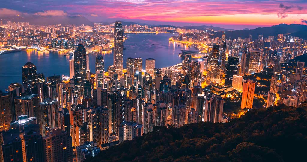
Its skyline is one of the most iconic in the world, lit up at night with a spectrum of colors and the famous "Symphony of Lights" show, flashing across the skyscrapers. Hong Kong’s neon industry has been slowly phased out by progression in sign-making, but its history has been detailed by photographers and historians in the link above.
The Neon Boneyard, Las Vegas, Nevada, USA
Many of the most well-known neon displays from the golden era of Las Vegas casinos were created by Young Electric Sign Company (YESCO). This Salt Lake City-based corporation has had a storage facility in Las Vegas for decades. Over the years, this three-acre area has become a cemetery of abandoned neon signs. There are reported to be over 150 neon signs from Las Vegas’ biggest casinos on show, with pieces that date back to the 1930s through to present day. It’s well worth a visit for anyone who loves the history of Vegas.
Magowan's Infinite Mirror Maze, San Francisco, USA
Created by Yale psychology graduate Charles Magowan, this maze is a cool 2,000-square-foot attraction boasting 77 mirrors guaranteeing to give you a totally sober psychedelic experience. You can get lost in the labyrinth for as long as you like, while surrounded by infinite reflections of yourself, all while listening to a fitting ‘80s soundtrack accompanied by flashy neon lights.
Electric Ladyland, Amsterdam, Netherlands
At this tiny Amsterdam gallery, fluorescent art reigns supreme. Founded by Nick Padalino, an artist and the human embodiment of the revolutionary spirit of the 1960s. The only attraction of its kind, Electric Ladyland is dubbed “The First Museum of Fluorescent Art”. Padalino’s concept will immerse any visitors in the exhibition in what he calls ‘participatory art’. You’ll go on a tour of the fascinating world of fluorescence, where everything ignites, shines, radiates, and changes colors.
Toledo Art Station, Naples, Italy
Completed in 2012 as part of the city’s Art Stations project, the station was designed by Spanish architect Oscar Tusquets Blanca and doubles as a contemporary art gallery hosting works of such artists as William Kendridge, Robert Wilson, and Achille Cevoli. One of the most beautiful subway stations in the world, it was created to bring art to people’s everyday lives.
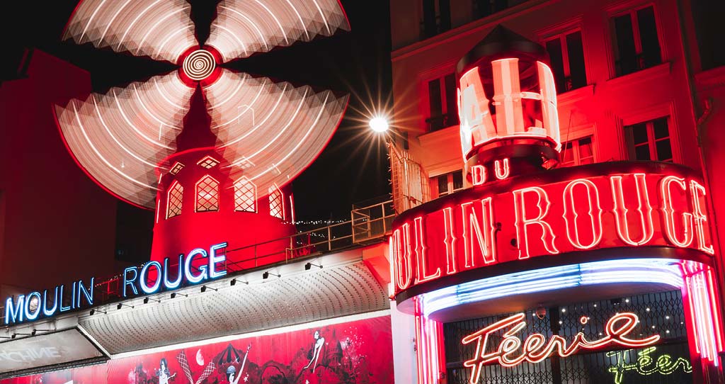
The most famous cabaret in the world - Paris’ Moulin Rouge (built in 1885) is known for its Champagne-filled parties that pioneered cabaret and the famous French cancan dance. The iconic windmill gives a glimpse into the otherworldly past of Paris, where Montmartre was once a tiny village full of windmills.
Glow Park is a neon wonderland, putting life into the night with its dazzling attractions. It’s one of the biggest glow-in-the-dark gardens in the world, and has been handmade with a beautiful array of environmentally friendly lights.
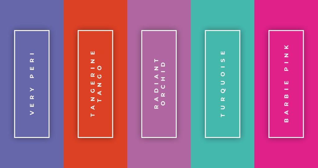
How To Style Your Home Using Five Iconic Pantone Colors
Since 1999, New Jersey-based graphic and textile-design house Pantone has chosen a color of the year. With its influence reaching products across fashion, home interiors, and industrial design. Before choosing each year’s color, the experts at Pantone’s Color Institute trawl the world for inspiration in a host of industries.
These include, but aren’t limited to, the entertainment industry and films in production, travelling art collections and new artists, fashion, all areas of design, and popular travel destinations.
We’ve chosen five of the boldest Pantone colors in history so you can style them in your home. Including the 2022 Pantone color of the year, these shades are still hugely impactful and bold to this day. These colors are perfect for informing the overall style of your space, and in the right context, they’re perfect for setting the mood.
Pantone Color Of The Year, 2022 - Very Peri
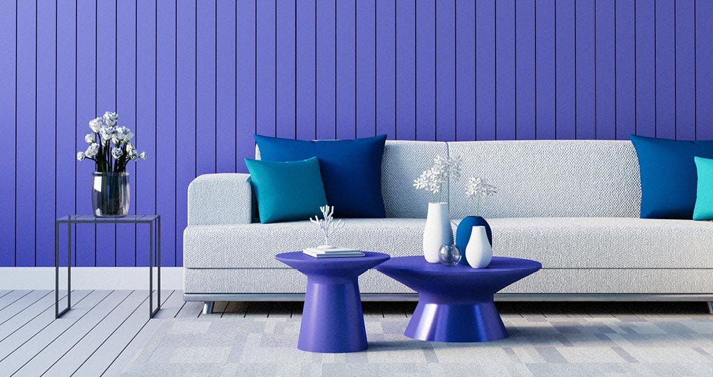
HISTORY: In Pantone’s words, as the world comes out of a period of intense isolation, Very Peri reflects people’s hopes of a bright new future. Laurie Pressman, Vice President of Pantone’s Color Institute said “As society continues to recognise color as a critical form of communication, and a way to express and affect ideas and emotions and engage and connect, the complexity of this new red violet infused blue hue highlights the expansive possibilities that lay before us.”
USE IT AT HOME: This is the first time that Pantone have manufactured a new color of the year instead of delving into their extensive archives, so reflect that newness and the excitement of 2022 by going bold with this shade. Pantone want this color to reflect a welcoming return to social life, so mirror that by adding it to your hallway. You'll invite friends in with extra warmth and optimism.
If accessories are more your thing, then why not scatter the color around any lounging spaces in time for the warmer months. The contrast of any existing neutrals with this bold and bright color will bring life to your home.
Pantone Color Of The Year, 2012 - Tangerine Tango
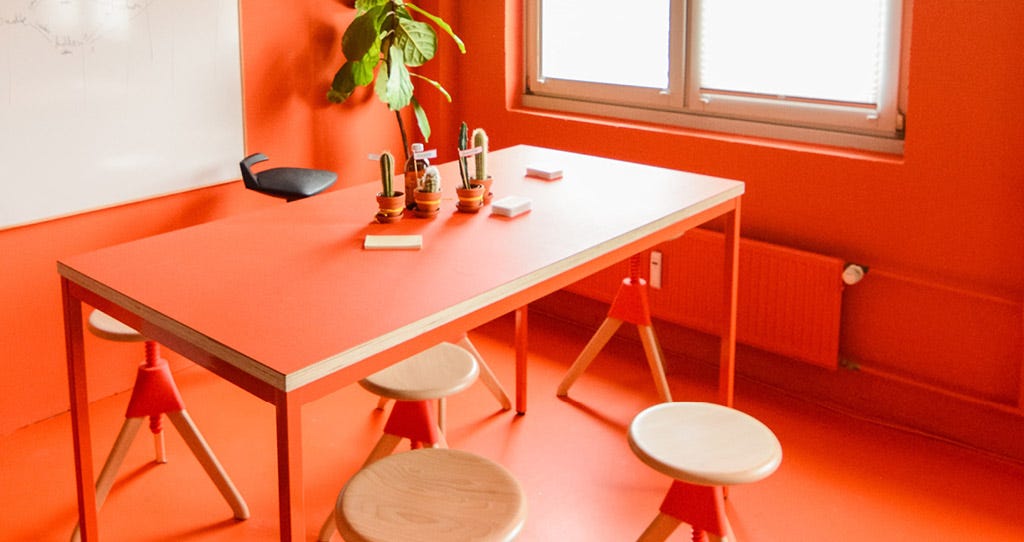
HISTORY: In 2012, the color orange was making a huge revival in the fashion scene. So Pantone released tangerine tango as a nod to that trend. With brands like Tommy Hilfiger and Nanette Lepore making waves using it on the catwalk. Fast forward to 2022 and the 70s have made a comeback within the world of interior design. Sunshine yellows, hot fudge browns and deep oranges are starting to dominate wallpaper, furniture and accessories alike.
USE IT AT HOME: Although it’s traditionally an autumn hue, this vibrant shade of deep orange can be used all-year-round when paired with creamy colors throughout your home. Add complementary colors like red and fuschia if you’re looking to make it pop, while a toned-down look can be achieved with colors like mint and modern blues.
If you want to be bold, reignite 2022’s trend of wallpaper décor in the home with a tangerine pattern in your living room, complemented by neutral walls and gold accented accessories for a touch of sophistication.
Pantone Color Of The Year, 2014 - Radiant Orchid
HISTORY: Radiant Orchid was an expressive blend of fuschia, purple and pink. Popular in men’s and women’s fashion - especially as it was meant to give the wearer a healthy glow when used in clothing - this confident deep lavender shade was sold by Pantone as “a captivating purple, one that draws you in with its beguiling charm.”
USE IT AT HOME: Radiant Orchid is an eye-catching hue that lends itself perfectly to paint, accent pieces and accessories. It complements shades like olive and hunter greens, as well as lighter yellows. As a contrasting color, it’s an ideal pairing for neutrals to give them life, especially grey, beige and taupe.
Pantone Color Of The Year, 2010 - Turquoise
HISTORY: Pantone released their tropical turquoise in 2010. Although it’s a bright and bold tone, their aim was to promote a soothing sense of wellbeing with a color that helped give a comforting escape from the everyday. As a tone that pairs well with most other colors on the spectrum, turquoise is an adaptable shade that can be used around the home in 2022.
USE IT AT HOME: Turquoise can be suited to any room at home, thanks to its vibrancy. A cool tone of turquoise like this Pantone shade works well in bathrooms and kitchens, contrasting well with the bright lights in those spaces. In the kitchen, opt for tiling your backsplash in turquoise so it doesn’t completely take over the room. If you have any rattan or wooden furniture in your bathroom that needs an update, upcycle it with a lick of paint. Smaller pieces won’t overwhelm the rest of the space and will complement an overall neutral color scheme.
Barbie Pink
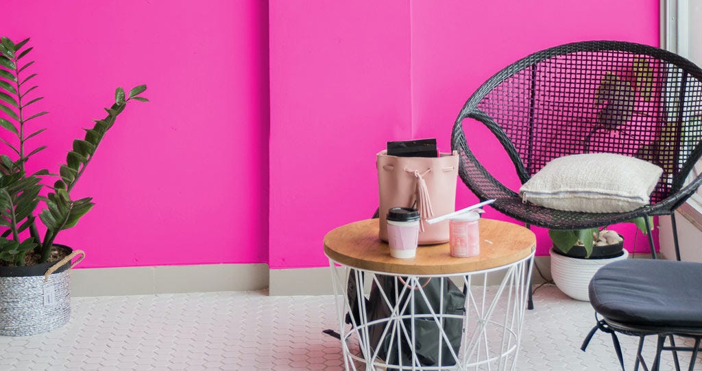
HISTORY: Mattel trademarked the beautiful and bouncy Barbie Pink. It’s exclusive to their line of toys and only to be used by their brand. However, there's now a shared recognition that pink can be pretty and powerful, feminine and feminist.
USE IT AT HOME: If you’re looking to keep it simple, pink pillows and flowers pair perfectly with a monochromatic look. Black and white complements most colors, especially if you’re looking to brighten your home for the warmer months.
For a bigger statement, pink neon signs can never go amiss (why not take your inspiration from the section above?). statement pink walls can brighten up a hallway, or cool it down depending on the shade. Remember you don’t have to stick to one tone either, create a totally unique space by experimenting with various colors like pastel pink, cherry blossom, and dark pink.
See more from PartyLite’s latest collection here, choose your favourite 3-Wick Candle here, and find your perfect complementary accessory here.